


Build stunning CSS gradients in seconds with our free, browser-based CSS gradient generator. Choose from three gradient types — linear, radial, and conic — add as many colour stops as you need, drag their positions, and watch the gradient update live in the preview strip above. When you are happy with the result, copy the complete background CSS property or a full .element { background: ... } rule with a single click.
No account required, no watermarks, no limits. Twelve hand-crafted gradient presets cover everything from a smooth two-colour brand fade to a vivid rainbow sweep — use them as starting points or design from scratch.
Loading tool…
Why Use a CSS Gradient Generator?
Writing CSS gradients by hand is one of those tasks that sounds straightforward until you are staring at a colour stop percentage that is four iterations away from looking right. Every adjustment sends you back to the code editor, and every “I wonder what this looks like at 45 degrees” costs another round-trip to the browser.
A live CSS gradient generator eliminates that loop entirely. You interact with sliders, colour pickers, and direction buttons and the gradient redraws in real time — no context-switching, no manual percentage arithmetic, no guessing. The difference in speed is dramatic, especially for multi-stop gradients where even small position or hue changes ripple across the whole effect.
Gradients are also one of the most versatile tools in a designer’s CSS toolkit. They can serve as hero backgrounds, card overlays, button fills, text clips, decorative borders via border-image, loading skeletons, and ambient glow effects when combined with box shadows. Getting them right visually — and quickly — means you spend more time designing and less time wrestling with syntax.
The preset library further shortens the path. PSDreviews presets are calibrated for real-world use: smooth brand fades, warm sunsets, cool blues, vivid rainbows, and elegant neutral washes. Pick the nearest preset, swap the colours to match your palette, and you have a production-ready gradient in under a minute.
Three Gradient Types Explained
Understanding which gradient type to reach for saves time and avoids common mistakes. Here is a plain-language breakdown of each type the tool supports.
Linear Gradients
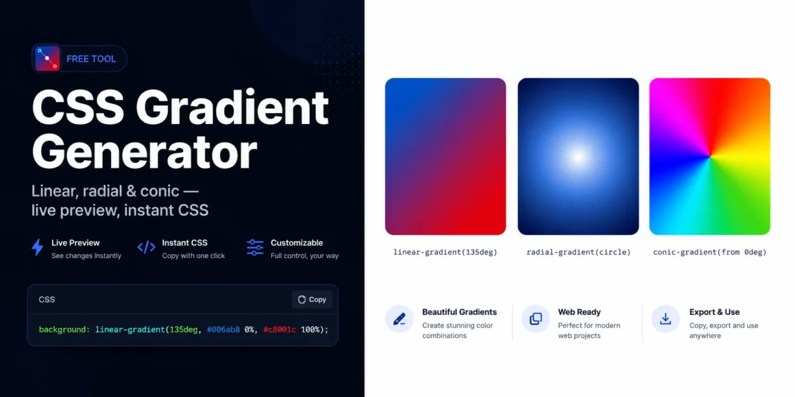
A linear gradient transitions colours along a straight line from one point to another. You define the angle — 0° is top-to-bottom, 90° is left-to-right, 135° is diagonal top-left to bottom-right, and so on. The most common angles in UI design are 90° (horizontal band), 135° (diagonal fade), and 180° (vertical fade from top).
background: linear-gradient(135deg, #006ab8 0%, #c8001c 100%);Linear gradients are the right choice for hero backgrounds, button fills, section dividers, and anywhere a clean directional sweep reads clearly.
Radial Gradients
A radial gradient radiates outward from a centre point in either an ellipse (default) or a circle shape. You can reposition the centre point to any of nine positions — centre, top, bottom, left, right, or any corner — to control where the gradient blooms from.
background: radial-gradient(ellipse at center, #fff 0%, #006ab8 60%, #0d0e14 100%);Radial gradients excel at spotlight effects, glow backgrounds, circular icons, and vignettes. The ellipse shape is the natural default because most elements are wider than they are tall.
Conic Gradients
A conic gradient sweeps colours around a centre point like the face of a clock, rather than fading outward. You control the start angle so the sweep can begin at any compass point. Conic gradients are newer to CSS but have universal browser support since 2021.
background: conic-gradient(from 0deg, #c8001c, #f97316, #facc15, #4ade80, #006ab8, #c8001c);Conic gradients are ideal for pie charts, colour wheels, progress ring decorations, and any circular or radial-sweep visual. They are less common in general UI design, which means using one thoughtfully can create a memorable, distinctive look.
How to Use the CSS Gradient Generator
Getting your first gradient out takes under two minutes. Here is the full workflow from start to paste.
- Choose a gradient type. Use the tabs at the top of the tool — Linear, Radial, or Conic. The controls panel on the left updates to show the relevant settings for the chosen type.
- Set the direction or angle. For linear gradients, click one of the eight compass direction buttons or drag the angle slider to any degree. For radial gradients, choose Ellipse or Circle and pick the centre position from the 3×3 grid. For conic gradients, drag the start-angle slider.
- Build your colour stops. Each row in the Colour Stops panel represents one stop. Click the colour swatch to open the native colour picker, then drag the position slider to set where that colour lands in the gradient. Add more stops with the + Add Stop button (up to six total). Remove stops with the × button — the tool always keeps a minimum of two.
- Apply a preset. If you want a shortcut, click any preset swatch in the strip below the preview. The entire gradient state — type, direction, and all stops — replaces with the preset values. You can then tweak from there.
- Copy the CSS. Use Copy background for the property value only, or Copy CSS rule for a complete
.element { background: ... }block. Both buttons confirm the copy with a brief label change.
Working with Colour Stops
Colour stops are the heart of every gradient. Each stop is a colour + position pair, and the browser smoothly interpolates between adjacent stops. Here is what to know for getting the most control.
Position matters as much as colour. Two stops with beautiful colours can still produce a muddy result if they are positioned too close together or too far apart. As a starting point, space stops evenly, then nudge positions inward toward each other to sharpen a transition, or outward to lengthen a colour band.
Using more than two stops unlocks richer effects. Three-stop gradients can hold a colour constant across a wide band (useful for text legibility on gradient backgrounds) by duplicating the middle colour at positions 30% and 70%. Five-stop rainbow gradients feel smoother when the hue steps are small and consistent.
White or black stops at the edge are a versatile trick. A linear gradient from transparent to rgba(0,0,0,0.5) produces a perfect overlay for text legibility on photographic backgrounds — a pattern used on almost every modern news site.
Opacity stops work via RGBA. The colour picker in the tool outputs hex values, but you can hand-edit the CSS output to use rgba() or hsla() values if you need semi-transparent stops for overlay effects.
Gradient Presets Reference
Ocean — a deep blue-to-cyan sweep on a 135° diagonal. Clean, professional, works well for SaaS product and tech-brand hero sections.
Sunset — warm orange fading into coral red at 135°. Energetic and emotive; popular for lifestyle brands, food, and travel landing pages.
Forest — dark green to mid-green at 160°. Natural and calm; suitable for sustainability brands, wellness, and outdoor product pages.
Purple Dream — violet through indigo at 120°. Rich and creative; works for portfolios, creative agencies, and app marketing pages.
Warm Gold — amber to yellow at 90°. Feels premium without being heavy; useful for pricing tables, award badges, and feature highlights.
Cool Blues — three-stop sky progression from deep navy through mid-blue to light cyan at 180°. The classic enterprise SaaS background.
Candy — three-stop pink-yellow-cyan sweep. Playful, Gen-Z aesthetic; used for social apps, gaming, and youth-oriented branding.
Midnight — near-black to deep navy at 135°. Sophisticated dark background; pairs well with white text and light-toned imagery.
Radial Glow — a radial gradient with a bright centre fading to dark. Spotlight effect for hero text, product shots, and feature sections.
Warm Radial — warm amber glow radiating from centre. Creates a natural, sunrise-like ambient feel; popular in meditation and wellness design.
Rainbow Conic — a full 360° conic sweep through all hue stops. Vivid and attention-grabbing; use sparingly as a decorative accent.
Pastel Conic — a soft-toned conic sweep at reduced saturation. Gentler than Rainbow; works as a background texture for cards and panels.
CSS Gradient Syntax Reference
For developers who want to understand and hand-tune the generated output, here is a concise syntax reference for all three gradient types.
linear-gradient() accepts an angle or keyword direction followed by two or more comma-separated stops.
background: linear-gradient(
  135deg,
  #006ab8 0%,
  #fff    50%,
  #c8001c 100%
);
Keyword directions — to right, to bottom right, etc. — are equivalent to 90deg, 135deg, and so on. The MDN documentation on linear-gradient covers the full specification including repeating variants.
radial-gradient() begins with an optional shape and position clause before the stops.
background: radial-gradient(
  ellipse at center,
  #fff 0%,
  #006ab8 60%,
  #0d0e14 100%
);
The shape is ellipse or circle; the position follows at and accepts any CSS position value. See the MDN radial-gradient reference for the full extent/size keywords.
conic-gradient() accepts an optional from and at before the stops.
background: conic-gradient(
  from 0deg at center,
  #c8001c   0%,
  #f97316  25%,
  #4ade80  50%,
  #006ab8  75%,
  #c8001c 100%
);
Note that conic gradient stops are angles or percentages of 360°. The MDN conic-gradient reference explains the at position syntax in full.
Browser Support and Vendor Prefixes
All three gradient types have broad browser support and require no vendor prefixes for modern use.
linear-gradient and radial-gradient have been unprefixed since 2013 across all major browsers. conic-gradient achieved full unprefixed support in Chrome 69 (2018), Firefox 83 (2020), and Safari 12.1 (2019). All three are safe to use without prefixes for any project targeting browsers from the last five years.
If you need to support Internet Explorer 11, only linear and radial gradients are available via the vendor-prefixed -ms-linear-gradient() syntax. IE11 does not support conic gradients. Given IE11’s market share is below 0.5%, most projects no longer need to account for it.
The generated CSS from this tool is unprefixed and production-ready for all modern browsers.
Combining Gradients with Other CSS Properties
Gradient + background-size + background-repeat creates stripe patterns. A linear-gradient(90deg, #006ab8 50%, transparent 50%) tiled at 20px 100% produces evenly spaced vertical stripes without any images.
Multiple backgrounds let you layer gradients. CSS background accepts a comma-separated list, so a semi-transparent gradient overlay can sit above a fallback colour or even another gradient:
background:
  linear-gradient(rgba(0,0,0,0.4), rgba(0,0,0,0.4)),
  linear-gradient(135deg, #006ab8, #c8001c);
background-clip: text with -webkit-text-fill-color: transparent makes gradient-filled text — a popular heading treatment. Apply a linear gradient to the element, set background-clip: text, and the text itself becomes the visible portion of the gradient.
border-image with a gradient creates gradient borders without needing multiple elements or pseudo-elements. The syntax differs from background but the gradient function is identical.
For hands-on depth effects, combine a gradient background with our CSS Box Shadow Generator — a layered soft shadow beneath a gradient card creates a convincing sense of elevation that stands out from flat design.
Gradient Design Tips
Limit hue jumps to avoid muddy transitions. When two adjacent colour stops are far apart on the colour wheel and the browser interpolates through desaturated midpoints, the transition looks grey and dull. Either add an intermediate stop at a midpoint hue to guide the blend, or use HSL-based colours where you can fine-tune the saturation along the path.
Match gradient angle to perceived light source. Most users expect light from above-left (135°). A top-left to bottom-right diagonal gradient reads as the most natural direction for elevation and depth effects.
Use very low-opacity gradients for subtle texture. A linear-gradient(135deg, rgba(255,255,255,0.08) 0%, rgba(0,0,0,0.08) 100%) over a flat brand colour adds a barely-visible sheen that makes an element feel dimensional without obviously “having a gradient.”
Test dark and light mode. Gradients that look vivid on a light background can look washed-out or overly strong on dark mode backgrounds. If your project supports both modes, preview the gradient in context on both before committing.
Coordinate stop colours with your palette. Use our Colour Palette Generator to establish a 5-colour harmony, then pick your gradient stops from that palette. The result will feel intentional and on-brand rather than arbitrary.
What is a CSS gradient generator?
A CSS gradient generator is a visual tool that lets you build CSS gradient values interactively — choosing colours, stop positions, angles, and gradient type — and outputs ready-to-paste CSS code. It removes the need to hand-write gradient syntax and lets you see the result before committing it to your stylesheet.
Is this CSS gradient generator free?
Yes, entirely free. No account, no usage limit, no watermark. The tool runs entirely in your browser and generates clean, standard CSS that you can use in any personal or commercial project without attribution.
How many colour stops can I add?
The tool supports up to six colour stops per gradient. Most gradients look their best with two to four stops — beyond that, transitions can start to feel busy unless you are intentionally building a rainbow or spectrum effect.
Do I need to add vendor prefixes to the generated CSS?
No. All three gradient types — linear, radial, and conic — work across all modern browsers without vendor prefixes. The generated CSS is ready to use as-is. If you specifically need IE11 support, that browser requires the -ms- prefix for linear and radial gradients, but conic gradients are not supported in IE11 at all.
What is the difference between a linear and a radial gradient?
A linear gradient transitions colours along a straight line at a set angle. A radial gradient radiates colours outward from a central point in either an ellipse or circle shape. Linear gradients are more common in UI backgrounds and buttons; radial gradients are better for spotlight, glow, and circular effects.
What is a conic gradient?
A conic gradient sweeps colours around a centre point in a clockwise direction, like the hands of a clock sweeping the dial. Unlike radial gradients which radiate outward, conic gradients rotate around the centre. They are ideal for pie charts, progress rings, and colour wheels.
Can I use gradients as border colours?
Yes, using the border-image property. Set border-image: linear-gradient(...) 1. This technique does not support border-radius, so for rounded gradient borders you need to use a pseudo-element approach instead. The Colour Palette Generator can help you pick coordinated border gradient colours.
Can I use the generated gradient as a text fill?
Yes. Apply the gradient to the element’s background, then set background-clip: text and -webkit-text-fill-color: transparent. This makes the text itself the “window” into the gradient, creating a gradient text effect. It works in all modern browsers.
How do I create a transparent gradient?
Use rgba() or transparent as one of your stop colours — for example, rgba(0,106,184,0) is a fully transparent version of the PSDreviews blue. Gradients from a colour to transparent are the standard technique for image overlay fades, header transparency effects, and fade-to-background edge treatments.
Why does my gradient look grey or muddy in the middle?
This happens when two colour stops that are far apart on the colour wheel are interpolated through the desaturated centre of the sRGB colour space. CSS interpolates gradients in sRGB by default, and complementary colours (like red and blue) pass through a low-saturation zone. The fix is to add a third stop at the midpoint position with a vivid intermediate colour (like purple for red-to-blue), which guides the transition through a more saturated path.
Related Tools
- Colour Palette Generator — Generate a coordinated 5-colour harmony to use as your gradient stops
- CSS Box Shadow Generator — Add depth and elevation to gradient cards and panels
- Contrast Checker — Verify that text placed over your gradient meets WCAG accessibility contrast ratios
- Border Radius Visualiser — Fine-tune the corner rounding of the element carrying your gradient